North High Brewery, located in Columbus, Ohio, provides a unique experience to their customers. In addition to offering a wide variety of locally brewed craft beer, they also offer their patrons the option of brewing their own beer.
I was lucky enough to be able to experience this with some of my family and friends. After the brewing process is finished they allow you to create your own label to send over before coming back a few weeks later to bottle and package your beer. Being the only Graphic Designer in my group, I got to design the label.
packaging DESIGN
Mongoose a.s.o.
The objective of this project was to complete a series of 20 pictograms meant to function within a chosen setting. My chosen setting was Disney World. This process included research, planning, objective-setting, conceptualizing, audience-testing, and form-making. After the set of 20 icons in color was completed. The second step was applying the icons in various applications related to Disney World.
Deciding on a final set to create was definitely a struggle. I was originally just going to re-design 20 of the pictograms that Disney already had, but after discussing it with my instructor we both agreed that it would be more interesting to try making icons for some of the attractions, the park, and some general icons as well. Sometimes the parts that seem the simplest can turn out to be the most complicated. This set can be separated into three different categories: Attraction specific pictograms, Park specific pictograms, and Park generic pictograms. This created a challenge for me in that I would have to technically create three separate categories of icons that all look cohesive enough to belong in the same set. However, they would also look best if the 3 categories differentiated themselves from each other slightly because they are each representing different types of pictograms.
ICON DESIGN
DISNEY WORLD ATTRACTIONS
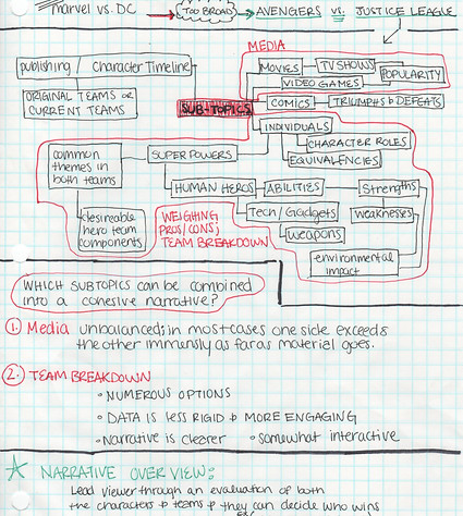
The objective of this project was to create a composition that compared two topics. I chose to compare the Justice League and the Avengers. My goal was to give the viewer a quick summary of the strengths within each team. I then chose four distinct environments and highlighted three useful skills that would prove to be advantageous for each based on the various environmental conditions. I then plotted the team members accordingly while noting exceptions that didn't have 1 of the 3 skills but would still thrive in the environment.
data visualization
Justice league vs. avengers

02 Research
I started by looking at all of the different super powers and abilities that were represented in each team. This took a while considering I had to research each individual character. I noticed that a lot of heroes had similar powers so I listed all of the powers out and noted who had which power. After seeing the data in this way I could narrow down the different areas/skills/powers that I wanted to show comparisons on.
01 planning
The Research for this project was very extensive. The topic began as Marvel vs DC but the scope narrowed to Justice League vs Avengers. After deciding on comparing the strengths of each team, I decided to take it a step further and display the information in a way that allowed the viewer to see how each team would measure up in a fight based on their surroundings. In short,
I was asking the viewer, "Who would win?"

03 Developing
a System
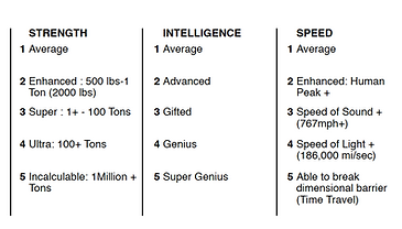
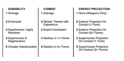
After defining the set of skills to compare I realized I would need a rating system for the chosen variables. I went back to my research and discovered that the skill levels for each character were able to be found with enough digging. I then gathered the data for each character and in doing this, was able to set a minimum (1) and maximum (5) for each variable.

04 The Battlefield
Then I chose 4 very different environments, all requiring their own distinct set of skills and each presenting their own set of challenges.


