North High Brewery, located in Columbus, Ohio, provides a unique experience to their customers. In addition to offering a wide variety of locally brewed craft beer, they also offer their patrons the option of brewing their own beer.
I was lucky enough to be able to experience this with some of my family and friends. After the brewing process is finished they allow you to create your own label to send over before coming back a few weeks later to bottle and package your beer. Being the only Graphic Designer in my group, I got to design the label.
packaging DESIGN
Mongoose a.s.o.
The objective of this project was to complete a series of 20 pictograms meant to function within a chosen setting. My chosen setting was Disney World. This process included research, planning, objective-setting, conceptualizing, audience-testing, and form-making. After the set of 20 icons in color was completed. The second step was applying the icons in various applications related to Disney World.
Deciding on a final set to create was definitely a struggle. I was originally just going to re-design 20 of the pictograms that Disney already had, but after discussing it with my instructor we both agreed that it would be more interesting to try making icons for some of the attractions, the park, and some general icons as well. Sometimes the parts that seem the simplest can turn out to be the most complicated. This set can be separated into three different categories: Attraction specific pictograms, Park specific pictograms, and Park generic pictograms. This created a challenge for me in that I would have to technically create three separate categories of icons that all look cohesive enough to belong in the same set. However, they would also look best if the 3 categories differentiated themselves from each other slightly because they are each representing different types of pictograms.
ICON DESIGN
DISNEY WORLD ATTRACTIONS
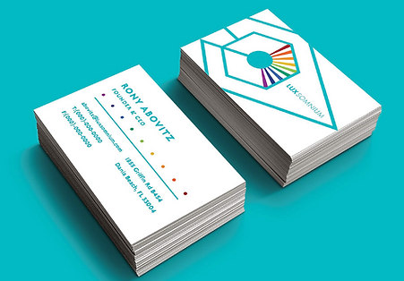
identity DESIGN
lux somnium
The objective of this project was to take an existing company and rebrand them. The company I chose makes a new type of VR using a dynamic light field.

INITIAL SKETCHES


LAYOUT & STRUCTURE
APPLICATION OF COLOR


ICON DESIGN
This set of icons is designed for the interface that the user will see when they turn on their glasses. Each icon will act like a folder that holds the features or downloaded applications that are relative to that specific icon.

BUSINESS CARDS
There are four different design variations for the front of the business card. One design utilizes a subtle pattern crafted with the brand mark. The other design features a large scale cropped version of the mark. These designs are cohesive but still have an individual feel.

WEBSITE
Lux Somnium is based entirely around a visually stimulating experience. It only makes sense that the brand’s identity reflected this. The technology that we have created is unlike anything that anyone has ever seen and we want to share it with the world. This motive has led to a brand design rich in large scale aesthetic and engaging imagery

