North High Brewery, located in Columbus, Ohio, provides a unique experience to their customers. In addition to offering a wide variety of locally brewed craft beer, they also offer their patrons the option of brewing their own beer.
I was lucky enough to be able to experience this with some of my family and friends. After the brewing process is finished they allow you to create your own label to send over before coming back a few weeks later to bottle and package your beer. Being the only Graphic Designer in my group, I got to design the label.
packaging DESIGN
Mongoose a.s.o.
The objective of this project was to complete a series of 20 pictograms meant to function within a chosen setting. My chosen setting was Disney World. This process included research, planning, objective-setting, conceptualizing, audience-testing, and form-making. After the set of 20 icons in color was completed. The second step was applying the icons in various applications related to Disney World.
Deciding on a final set to create was definitely a struggle. I was originally just going to re-design 20 of the pictograms that Disney already had, but after discussing it with my instructor we both agreed that it would be more interesting to try making icons for some of the attractions, the park, and some general icons as well. Sometimes the parts that seem the simplest can turn out to be the most complicated. This set can be separated into three different categories: Attraction specific pictograms, Park specific pictograms, and Park generic pictograms. This created a challenge for me in that I would have to technically create three separate categories of icons that all look cohesive enough to belong in the same set. However, they would also look best if the 3 categories differentiated themselves from each other slightly because they are each representing different types of pictograms.
ICON DESIGN
DISNEY WORLD ATTRACTIONS
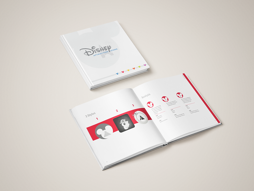
After the topic of Disney Attraction Icons was decided I developed three distinct styles and weighed the pros and cons of each. I decided to go with the third option.

The final Black and White set includes 12 Popular Attraction Specific Icons, 4 General Universal Icons, and 4 icons representing the 4 Main Parks.

I found my inspiration for the color palette from popular Disney films. What better place to find inspiration?

I developed various patterns using my icons and applied them to a product that is widely recognized and used in disney parks; coffee cups.

I chose to apply my patterns digitally to a conceptual Disney Park Maps Application.

For the space application, I chose to apply the pattern as a wall graphic in a resort conference room.

I chose to use the icon of The Rock N' Rollercoaster on the street sign for Sunset Blvd.

I used the Space Mountain Icon as an addition to the attraction's entryway sign.

I used two of the park icons on the side of a bus stop in a way-finding application for Disney's Park Shuttle Busses.